2.3 Persuasion: Visual Rhetoric
Linda Macdonald
Learning Objectives
By the end of this chapter, you should be able to
- Explain the impact of effective design on readability and persuasive strategy
- Determine the best typefaces for your purpose, audience, and channel
- Explain the importance of restraint and consistency in document design
- Explain the effective use of colour as a persuasive device
- Describe the impact of layout and composition on audience reaction and readability
Self-reflection
Before reading this chapter, spend a few minutes thinking about these questions:
- What characteristics would you like prospective employers to see in you?
- What value do you bring to the employer?
- How do you want employers to feel when they look at your documents?
Design ensures readability. Design can also contribute to the persuasiveness of your message. Poor design, on the other hand, can result in a lack of readability. Even worse, poor design can frustrate or annoy your audience or make the document inaccessible to readers with low vision.
To design effectively, consider text, colour, graphics or images, and layout and composition. Visual rhetoric is the effective combination of these elements to inform or persuade your audience. This six-minute video serves as an introduction to Visual Rhetoric. Watch the video, answer the questions, and submit your answers through the green button at the end.
(Direct link to Visual Rhetoric by Owl Purdue video)
Text
Typeface and font size can affect the readability and persuasiveness of written documents and slides. Because the visual qualities of text can influence the way a viewer thinks and feels, business writers need to have a basic understanding of typography. This six-minute video provides these fundamentals. You will be asked five questions. Submit your answers when prompted through the green button.
(Direct link to Beginning Graphic Design: Typography by GCFLearnFree.org video)
Typeface and Mood
Handwritten letters can communicate information about the writer and convey this feeling to the readers. A person writing from the trenches in WWII might reveal pain or fear through shaky script. A 13-year old might use hearts to replace the dot on an “i” as a demonstration of true love. Cursive writing can convey tradition and formality.
Today, computers offer a wide range of fonts in various weights and sizes. The challenge in the modern world is to select a font that matches the feeling the words are meant to convey.
 For example, this protest sign “I Want You to Panic” uses a font to convey a sense of urgency in dealing with climate change. The font matches the feeling of panic the protester hopes to create in the reader.
TikTok and Instagram use fonts that appeal to young users, while The New York Times and The Globe and Mail use serif fonts to reinforce the credibility that comes with older and experienced organizations. The design is selected to inspire confidence and meet the expectations of an older reading audience.
Another example of the ability of a font to convey feeling is illustrated in the next video. The two-minute video celebrates Gilbert Baker, the artist and activist who created the Rainbow flag in 1978. The feeling conveyed by the Gilbert font is “pride”. A comment from The Huffington Post in the video describes the font as “a typeface that translates the strength of the rainbow flag into text.”
(Direct link to Type with Pride by NewFest and NYC Pride video)
Consider the ability of fonts to convey feeling as you craft business documents and slides. Ask yourself,
- What is the mood or feeling of the typeface(s) I have chosen?
- What image or impression is suggested by this choice?
- Does the typeface communicate the feeling I wish to convey?
For example, Jim would like to open an accounting business. What mood does each typeface convey? Does the typeface suggest the image Jim would like to convey?
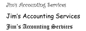
Among other possible impressions, the first typeface conveys playfulness, the second conveys immaturity, and the third may indicate that Jim is creepy and/or evil. Not the impressions that Jim would like to send. A better choice is one that conveys reliability and credibility:
![]()
This typeface is Baskerville, a serif font carrying “a distinguished feeling of heritage and pedigree” (Gendelman, 2015). The font may look familiar to you: The government of Canada uses a variation of this typeface.
Serif and Sans Serif
Because they convey a professional tone, serif fonts (those with letters that have small tags on them) like Times New Roman, Garamond, Georgia, Baskerville, and Palatino are all popular for printed business and academic documents. When you write a cover letter for a co-op application or a formal report for a client, you need a font that appears trustworthy and reliable. As designer Dylan Todd says, “When you are designing with type, the typeface you choose tells a story” (Adobe InDesign, 2021). The font conveys and affirms the story you would like the audience to hear about you as a young professional or a representative of the organization. Serif fonts are harder to read on lower quality monitors, but some can work well for online content if the font size is adjusted, if the letters do not appear to touch, and if the line height (the space between lines of text) is big enough.
Sans serif fonts like Arial, Calibri, Tahoma, or Verdana Pro have a clean, modern feel, and they work well for online media. You can also see sans serif fonts on posters, store signs, and highway signs because these fonts can be quickly and easily read in small amounts. The quick readability of sans serif fonts makes these fonts good for headings in reports. It is not a good idea, however, to use these fonts for large blocks of text, as in a printed report. You may also want to avoid them in cover letters and résumés because the sans serif fonts take up much more space than serif fonts. The industry standard for finance résumés is a single page, and you will need to maximize your space.
Languages that use other alphabets also use a variety of font styles. Chinese regularly uses approximately 7,000 of the tens of thousands of characters, so the fonts available are more limited than English with its 26 characters, but a variety of typefaces are available. Just as typefaces written in English using the Latin alphabet convey feeling, Chinese typefaces also carry meaning. As with Latin fonts, “a crucial initial decision is to determine which font ‘style’ to use. Chinese has two main styles, called Mingti and Heiti, akin to the serif and sans-serif of Latin. Heiti is a bit like sans-serif: clean, straight lines without extra ornamentation at the ends, common on the web. Mingti is similar to serif, with extra embellishment at the end of strokes that give it a more bookish feel” (Sonnad, 2015). The Arabic script also comes in a variety of fonts, and, as with fonts using the Latin alphabet, each font conveys mood or feeling.
Restraint and Consistency
Documents and slides can look busy, cluttered, or incoherent if too many typefaces and sizes are used in a single document or slide set. To maintain a professional look, limit the number of typefaces you use to two or three in a document or slide. In many longer business documents, sans serif fonts are used in headings with the body text in a serif font. To determine what fonts might be compatible, visit typ.io. The site recommends fonts that work well together and provides examples of how they might be used. For example, the site introduces Baskerville with “Baskerville is a serif font. It goes well with Lucida Grande, Helvetica Neue, Moderat, Open Sans, Adelle, Avenir Next, Frutiger, Avenir, Georgia and Proxima Nova.” Canva.com also offers suggestions on font compatibility as well as on colour pallets.
Depending on the typeface, select a type size of 10-12 pt. for body text. In APA Style academic writing, headings use the same typeface and font size as the body. In the workplace, depending on your company’s style preferences, headings may be 12-18 pt.
Use type styles like bold, capitalization, or italics to add emphasis. Keep in mind that if too much is emphasized, nothing is emphasized at all.
Self-reflection
Consider again what characteristics and potential value you want your prospective employer to see in you.
- How can you use typeface to help the audience see these characteristics and your value?
- How can you use typeface to generate the emotions you want the prospective employer to feel when reading your documents?
Colour 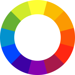
Like typeface, colour can also reflect mood, and it is equally important to maintain a simple and consistent colour scheme, if colour is used at all. In formal business documents like letters or memos, the use of colour will likely be limited to the logo at the top of the page. Formal reports may use colour on the cover page and in the graphics and figures, but this channel of communication requires restraint to keep the focus on the content. Using colour on report headings in the body of the report can negatively affect the formality and readability. Newsletters, posters, websites, blogs, and annual reports, on the other hand, benefit from more use of colour. As with typeface and font size, consistency and restraint are essential. You will need to balance the elements of ethos, and the effect on credibility and professionalism, with the elements of pathos, and the effect on mood and feeling.
In some cases, a lack of colour can negatively affect your message. A multiple line graph without colour can make the lines in the graph indistinguishable. The graph, then, loses meaning.
This six-minute video explains the effect and use of colour and will help you in selecting colours for report graphics and slide decks. Watch the video, answer the questions, and submit your results.
(Direct link to Beginning Graphic Design: Colour by GCFLearnFree.org video)
Before selecting colours, check your document for accessibility to ensure you reach all members of your audience. Eight percent of your audience may be affected by colour blindness. Adobe’s colour wheel can help determine if your colour scheme is Colour Blind Safe. The Adobe Accessibility page also has a Contrast Checker. If you are creating a line graph or bar chart, using this contrast checker can help you decide which colours are most appropriate. Avoid colour combinations such as red and green, and use a high contrast colour palette.
Layout and Composition
The arrangement of visual elements on a page also contributes to its persuasive appeal. A single-spaced block of text with no paragraph breaks or headings can overwhelm a reader. Densely packed PowerPoint slides can have the same detrimental effect. This five-minute video provides an overview of the basics of layout and composition. Watch the video, answer the questions, and submit your results.
(Direct link to Beginning Graphic Design: Layout & Composition by GCFLearnFree.org video)
In reports, negative space (or white space) provides a place for the eye to rest and is essential for distinguishing sections. This white space adds rhetorical appeal by emphasizing organizational structure (an element of logos). Consistency in heading styles and alignment of visual elements add to readability. In reports, use a simple style and avoid wrapping text around your tables and figures. Wrapping makes the text more difficult to read on most word processors.
Your cover letter for job applications should also be designed using visual rhetoric. The layout of the business letter enables you to include a personal letterhead, with your name in a larger, bolded type followed by your contact details. The personal letterhead makes it easy for the hiring committee to access your information. The structure of a standard business letter includes negative space between your address, the recipient address, the greeting, the paragraphs, the closing and your name. Your use of this organizational pattern persuades the reader that you understand professional expectations in the workplaces, which demonstrates both logos and ethos. Following the structure also prevents readers from having to search for your details or standard business letter elements. A lack of readability can lead to frustration or annoyance– emotions you likely do not want to stir when applying for a position.
Conclusion
Visual rhetoric has a powerful effect on the persuasiveness of your message. You can use typeface, colour, and layout and composition to change the way your audience feels about you and the topic. Organizations often have departments of communications and marketing that standardize the organization’s letterheads, signature blocks, slide decks, and colour choices. These standards maintain the company’s brand image. When you are in the workplace, you will need to be familiar with the organization’s preferences. In your university, some instructors specify the expected layout. Where there are no standards in place, you will need to rely on your understanding of visual rhetoric to develop your strategy.
Check Your Knowledge (32 Questions)
References
Gendelman, V. (February 17, 2015). Font psychology: How typefaces hack our brains. Company Folders. https://www.companyfolders.com/blog/font-psychology-how-typefaces-hack-our-brains
Sonnad, N. (2015). The long, incredibly tortuous, and fascinating process of creating a Chinese font. Quartz. https://qz.com/522079/the-long-incredibly-tortuous-and-fascinating-process-of-creating-a-chinese-font/
Photo: panic © Markus Spiske adapted by Unsplash is licensed under a Public Domain license
