4.15 Tables, Charts, and Graphs
Jordan Smith; Melissa Ashman; eCampusOntario; Brian Dunphy; Andrew Stracuzzi; Stacey Taylor; Joshua Touw; Alana Michelin; and Paige Hagan
If used correctly, tables and figures make data more understandable for your reader. If you use more than three illustrations in your report, provide a List of Illustrations on a new page following your Contents page. Tables and figures are listed separately. See the example report in Chapter 4.16. Following APA guidelines, bold the table or figure label (for example, Table 1). Double space, and then place the title in italics (Table example). Cite the source of your data below the table or figure in a Note with the author or organization and date. We have presented one table and several figures illustrating tables in this chapter. Tables and figures are numbered separately. For example, note that the first two illustrations in this chapter are Table 4.15.1 and Figure 4.15.1.
Tables
Tables are rows and columns of numbers and words (though mostly numbers). They permit rapid access to and relatively easy comparison of information. If the data is arranged chronologically (for example, sales figures over a ten-year period), the table can show trends—patterns of rising or falling activity. However, tables are not necessarily the most vivid or dramatic means of showing such trends or relationships between data—for that, you’d want to use a line graph, which is discussed in the next section.
The major use of tables is for numerical data. Imagine that you are comparing different models of laser printers in terms of physical characteristics such as height, depth, length, weight, and so on. This type of data is perfect for a table.
A special type of table is called a matrix. Instead of comparing numerical values in the rows and columns, a matrix compares qualitative data (words). For example, imagine that you were comparing several models of a laser printer and you want to represent various information, such as cost, print speed, supply costs, and warranty terms, for each printer being considered. This information is ideal for a matrix, and it would be mostly words rather than numbers.
Formatting Requirements
In its simplest form, a table is a group of rows and columns of data. At the top of each column is a column heading, which defines or identifies the contents of that column (and often it indicates the unit of measurement). On the left edge of the table are row headings, which define or identify the contents of that row.
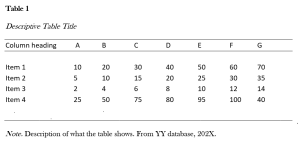
Table 4.15.1
Table example
Guidelines for Using Tables
As with other types of graphics, you should refer to the table in the text immediately preceding the table. You should also explain the general significance of the data in the table; don’t expect readers to figure it out entirely for themselves. If the table will not fit in its entirety after you introduce it in the text, continue with the text and insert the table as close as possible.
Don’t overwhelm readers with monster 11-column, 30-row tables. Simplify the table data down to just that amount of data that illustrates your point—without of course distorting that data.
Don’t put the word or abbreviation for the unit of measurement in every cell of a column. For example, in a column of measurements all in millimetres, don’t put “mm” after every number. Put the abbreviation in parentheses in the column or row heading.
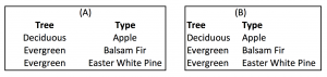
Right- or decimal-align numbers in the columns. If this convention is not followed, it can become difficult to quickly understand the size of the numbers. Figure 4.14.1 illustrates why, using a very simple example.
Figure 4.15.1
Decimal use in tables
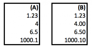
The decimal point in (A) is at different places, depending on the placement of decimals in the number. This format makes the table hard to read. In the second row, the 4 (which has no decimal places) should be under the 1 in the first row, not the 3.
In (B), the decimal point is in the same place every time, making it easier for the reader to quickly read and understand the numbers. (B) follows the decimal-align convention.
Normally, words in columns are left-justified (although you will occasionally see columns of words all centred).
Column headings are centred over the columns of numerical data (forming a T-shape). When the table contains text rather than numbers, the column headings are left-aligned. Figure 4.14.2 illustrates alignment.
Figure 4.15.2
Word alignment in tables
(A) is centered in each column, which makes it difficult to read. Using the correct convention, (B) is left-aligned, which is clearer and easier to read.
Just as you would cite and reference a paraphrase or a direct quote, so too must you cite and reference any tables that you use that were created by someone else or that were based on someone else’s data. Indicate the source of any graphic or data you have borrowed. Whenever you borrow a graphic or data from some other source, document that fact below the figure using an in-text citation. You should also include the reference information in the reference list.
A video explaining how to create tables in APA 7th edition is presented here. This video includes instructions on what to include in the general, specific, and probability notes section following the table. If you are preparing a report for an undergraduate course, ask your instructor if these notes should be included.
(Direct link to APA Style 7th Edition: Tables by Samuel Forlenza video)
Charts and Graphs
Charts and graphs are just another way of presenting the same data that is presented in tables. At the same time, however, you get less detail or less precision in a chart or graph than you do in the table. Imagine the difference between a table of sales figures for a ten-year period and a line graph for that same data. You get a better sense of the overall trend in the graph but not the precise dollar amount. Other types of charts and graphs are horizontal bar charts, vertical bar charts, and pie charts.
Formatting requirements
In bar charts and line graphs, don’t forget to indicate what the x and y axes represent. One axis might indicate millions of dollars; the other, five-year segments from 1960 to the present.
Bar charts, line graphs, and pie charts often use special colour, shading, or line style (solid or dashed). Be sure to indicate what these mean; translate them in a key (a legend) in some unused place in the chart or graph.
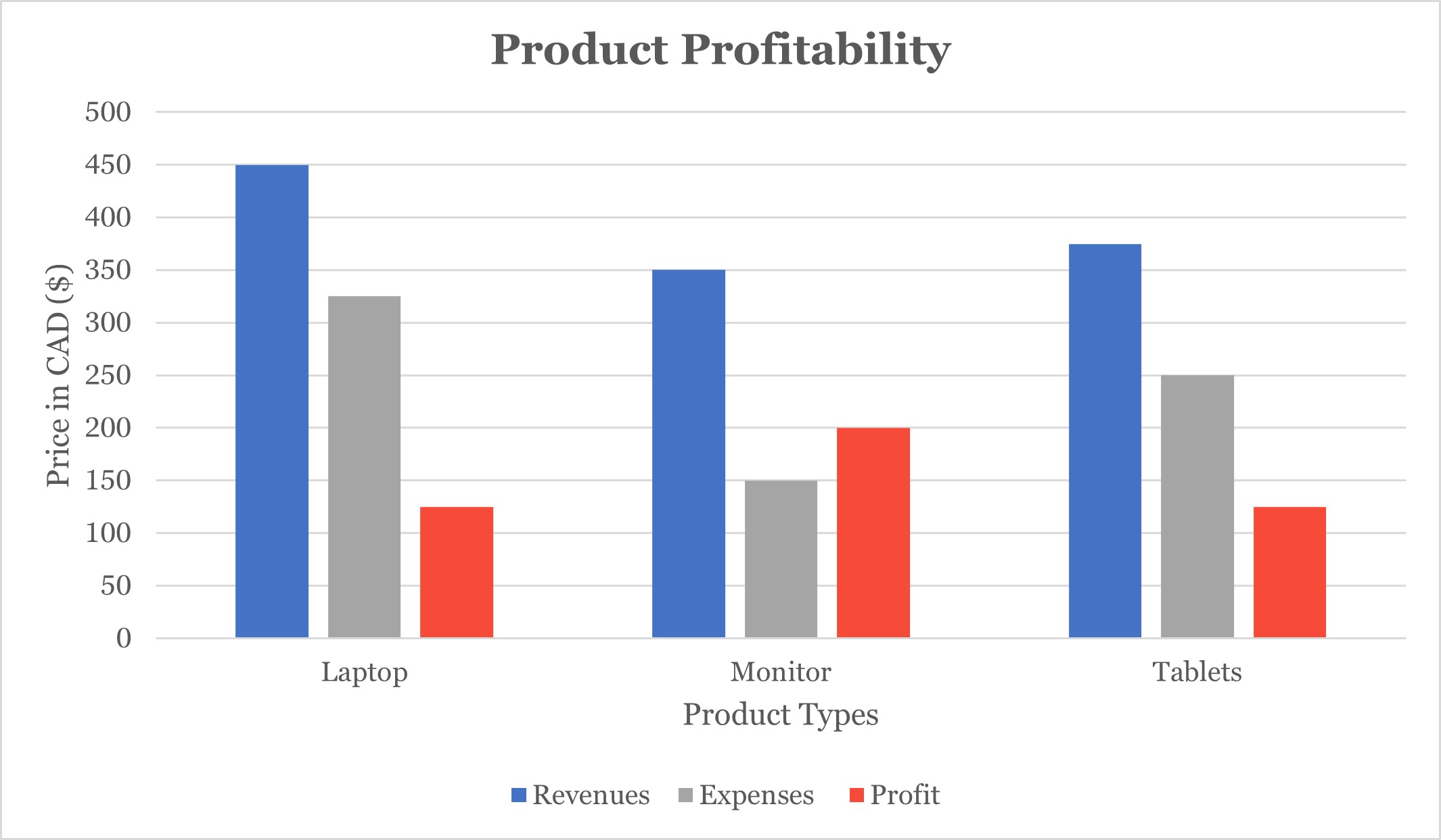
As shown in Figure 4.15.3, include a title and numbered label for your charts and graphs. Include the figure number in bold. Then create a line space and include the title of the figure in italics.
Figure 4.15.3
Format for Charts and Graphs
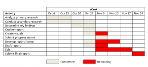
Gantt Charts
A Gantt Chart (Figure 4.15.4) shows activities with timelines for completion. According to Gantt.com, on the left side of the chart is a list of tasks and across the top are dates. Times, represented by bars, show the start date, duration, and end date of each task. These charts are useful in project management because they illustrate
- What the various activities are
- When each activity begins and ends
- How long each activity is scheduled to last
- Where activities overlap with other activities, and by how much
- The start and end date of the whole project (Gantt.com, 2021)
Gantt Charts are labelled as figures,. Summarize what the chart shows and introduce the figure by label in your document.
The following video by Paige Hagan explains the contents of a Gantt Chart and an example follows.
Figure 4.15.4
Format for Gantt Charts
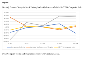
Line Graphs
Line graphs are used to show changes over time. For example, a line graph is appropriate for illustrating price changes over several months or daily production rates for the last two weeks. As with all charts, include a label and figure number in bold (for example, Figure 3) and a title in italics (for example, Percent Change of TSX and BMO Stock Values). This video shows you how to create a line graph:
(Direct link to How to Create a Line Graph by Alana Michelin video)
Just as you would cite and reference a paraphrase or a direct quote, so too must you cite and reference any charts or graphs that you use that were created by someone else or that were based on someone else’s data. Indicate the source of any graphic or data you have borrowed. Whenever you borrow a graphic or data from some other source, document that fact using an in-text citation. You should also include the reference information in the reference list.
Example: