12. Excel Spreadsheet for Accessibility
Ben Tait and Pratik Bhawar
Reviewing your Existing Spreadsheets for Accessibility
Accessibility Checker
Utilize this Accessibility Checklist to ensure you’ve covered the essentials of accessibility for any new or existing spreadsheets. Each item on the checklist is linked to the corresponding chapter/section, providing practical tips for further understanding and editing your spreadsheet.
- My spreadsheet has a title which is meaningful to the students/users?
- If not, please follow this link for more information on: Saving and Naming the file
- My spreadsheet uses Heading Styles to structure various sections of information?
- If not, please follow this link for more information on: Setting up your document for accessibility
- My spreadsheet uses standard and easily readable fonts?
- If not, please follow this link for more information on: Formatting text for accessibility
- My spreadsheet has sufficient colour contrast between the text and the background?
- If not, please follow this link for more information on: Enhancing Readability with Colour Contrast
- My spreadsheet uses tables which are simple and have definite header rows?
- If not, please follow this link for more information on: Using Tables within Excel
- My spreadsheet uses hyperlinks with concise and meaningful names?
- If not, please follow this link for more information on: Using Accessible Hyperlinks
- My spreadsheet has alternative text for images and other visual objects?
- If not, please follow this link for more information on: Create Accessible Images and Objects
- My spreadsheet has supplementary descriptions for embedded audio/video files?
- If not, please follow this link for more information on: Create Transcripts, Captions and Audio Descriptions
- My spreadsheet passes the accessibility checker?
- If not, please refer to the information in this chapter below.
Enable the Speaker Feature
Enabling the Speak feature in Microsoft Excel serves as a valuable preparatory step, especially when you are going to review your existing spreadsheets with the Accessibility Checker. Speak feature, can be used to audibly articulate the text in the cells of your spreadsheets to verify if they are placed in the appropriate reading order. This preview also assists you in evaluating the effectiveness of any adjustments made based on recommendations of the Accessibility Checker.
How to do it:
- Open the Excel desktop application.
- Navigate to the “File” tab, scroll down, and select “Options.”
- In Excel Options, click on “Quick Access Toolbar.”
- Choose the “Commands Not in the Ribbon” option from the “Choose commands from” dropdown menu.
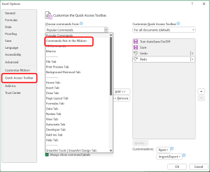
- Scroll down the commands list alphabetically, find “Speak Cells” and click on it.
- Add the Speak feature to the “Customize Quick Access Toolbar” pane by clicking on “Add.”
- Scroll down further, then click “OK” to confirm the changes.
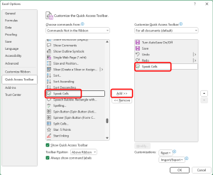
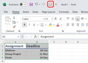
With “Speak cells” now added to your Quick Access Toolbar, you can easily activate it for any Excel document. Note that, by default, Speak is enabled for all Excel documents. If the Speak button appears inactive, simply select the text in your cells that you wish to be read aloud, and it will be activated.
Running the Accessibility Checker
When you already have a bank of resources created and want to begin by ensuring that those resources are optimized for accessibility, the first source of guidance is the Accessibility Checker. It serves as a quick preliminary check, swiftly scanning your content to pinpoint potential accessibility issues. This initial step offers an easy and insightful analysis, guiding you toward making informed edits and improving the overall electronic accessibility of your resources.
How to do it:
- Ensure your file is saved in the “.xlsx” format. Older formats may not be compatible with the checker.
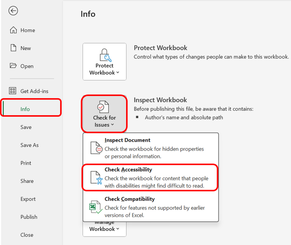
- Navigate to the “File” menu. Under the “Info” section in the left window pane, select “Check for Issues” and then choose “Check Accessibility.”
- A task pane will open, presenting the inspection results.
- Select a specific issue to view additional information and follow the provided steps to rectify or revise the content.
Common Accessibility Errors in Excel
Missing Object Description
When an object lacks a descriptive alternative, it becomes a hurdle for users relying on assistive technologies. Upon encountering an object without alternative text, the checker provides a clear directive to either “Add a description” or “Mark as Decorative“.
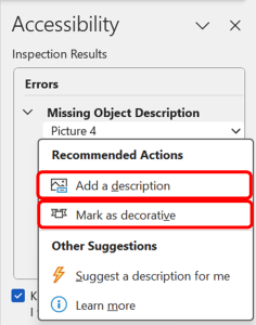
Consider the following questions for the next steps:
1.Does your graphic serve more of a decorative purpose? In other words, is it primarily a design element that does not convey content? If so, you should:
- avoid unnecessary text descriptions by clicking on “Mark as Decorative” option.
2.Does your graphic serve a functional purpose? In other words, is it conveying non-text content? If so, you should:
- provide a text alternative that serves the equivalent purpose of the non-text material by clicking on the “Add a description” option.
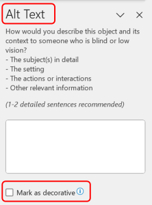
For detailed guidance on how to capture the meaning in Alt Text, see our dedicated section here: Chapter: Create Accessible Images and Other Visual objects
Follow this link for video instructions on: Making Images, Charts and other objects accessible in excel (external site – opens in new tab)
Missing Table Header
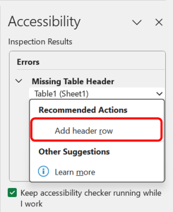
For tables intended to convey data, it’s essential to designate header rows explicitly. When creating new tables, excel by default makes the first row as the header, however, when the Accessibility Checker identifies a table without a specified header row, it signals a potential challenge for users relying on screen readers. To address this error:
- Select the option “Add header row” in the accessibility checker to designate the first row of the table as a header, or you could also check the “Header Row” box in the Table Styles option.
- Alternatively you can check the “My table has headers” option when creating a new table, to avoid this error altogether.
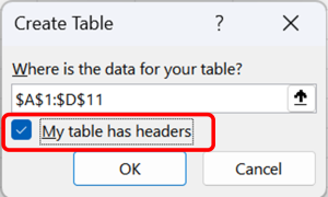
For detailed guidance on how to create an accessible table from scratch, see our dedicated section here: Chapter: Create Accessible Tables
Follow this link for video instructions on: Organizing data into Tables in Excel (external site – opens in new tab)
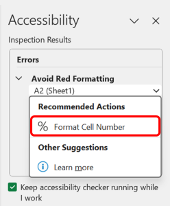
Avoid Red Formatting
When cells formatted to display numbers rely solely on red colour to convey negative numbers, a potential accessibility challenge arises. This may pose difficulties for individuals who, due to visual impairments or color perception variations, struggle to discern or interpret the numbers displayed in red as negatives in the spreadsheet. To address this error:
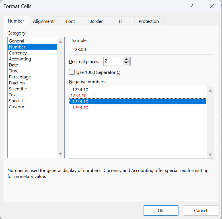
- Select the “Format Cell Number” from the recommended action in the accessibility checker which takes you to the number formatting dialogue box.
- Make sure to select a formatting which presents negative numbers in other ways such as – negative sign before the numbers, or number in parenthesis.
Common Accessibility Warnings in Excel
Use of Merged or Spilt Cells
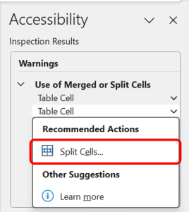
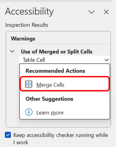
The “Merged or Split Cells” warning in Excel serves as a gentle reminder to evaluate the structure of your tables for optimal accessibility. While merged or split cells might not always pose a significant barrier, they can impact the coherent interpretation of the data in your tables by screen readers.
If cells have been merged within a table, consider whether this merging is essential for the visual presentation. If not, unmerge the cells by selecting “Split cells” option and vice-versa if there are split cells in your table.
For more information, and for guidance on how to create complicated tables, see this guidance from the Web Accessibility Initiative: link to W.A.I guidance (opens in new tab)
Hard-to-Read Text Contrast
The “Hard to Read Text Contrast” warning in highlights instances where text might pose readability challenges due to insufficient contrast with the background. Addressing this warning is crucial for ensuring that all readers, including those with visual impairments, can comfortably engage with your document. To address this warning:
- Font Colour: If the warning pertains to specific text elements, such as font or characters, a simple solution is to modify the “Font color”. Opt for high-contrast combinations to ensure readability for all readers.
- Fill Colour: If the warning specifically relates to table content, consider adjusting the shading settings. Select the option “Fill colour” to view and apply the most appropriate colour for the cells in your table.
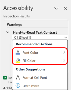
For detailed guidance on how to create appropriate colour contrast for your document, see our dedicated section here: Enhancing Readability with Colour Contrast
Follow this link for video instructions on:
1. Ensuring adequate colour contrast (external site – open in new tab)
Please don’t hesitate to contact us with suggestions and updates using this: email link for updates(opens in external site/application)
Reference:


Feedback/Errata