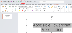
8. Accessible PowerPoint Presentation
Ben Tait and Pratik Bhawar
Creating Accessible PowerPoints from Scratch
One of the most common issues for accessibility within PowerPoint is the temptation to over-design our slides. Simplicity is key. Not only do unnecessary imagery, transitions and animations create more work for us (because we need to mitigate their impact on accessible technologies), they can also create visual distraction and cognitive overload. It can be satisfying to have a beautifully designed set of slides which inspire the learner’s confidence, but this should not be done in a way that creates barriers.
Simple, direct and consistent communication will support the wider range of learners, whilst also keeping things simple and time-efficient for you.
Also, while our focus here is on the creation of the resource itself, do remember to always use any amplification technology available within your teaching space, even if it feels unnecessary to you. Those using audio-enhancement technology such as hearing aids often rely upon such systems, even within small spaces and with small groups.
Saving and Naming the File
Similar to working with Word documents, the process of saving and naming your PowerPoint presentation is a seemingly straightforward yet crucial step. While your personal file-naming conventions might be clear to you, it’s essential to adopt an approach that makes sense to a broader audience without the need for extensive explanations. Consider that students are often managing multiple courses simultaneously and may be using a single laptop screen. To avoid confusion, instructors should ensure clear and consistent naming for PowerPoint presentations.
How to do it:
- If you’re developing a series of resources for a specific course, consider using the course name or code as the initial identifier. For instance:
“Syllabus_Fall2022” becomes “HESA4040_Syllabus_Fall2022”
- Follow the course code with the topic or content rather than just the week of delivery:
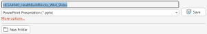
“HESA4040_Week4_Slides” becomes “HESA4040_HealthBuildBlocks_Wk4_Slides”
- Only abbreviate where there can really be no doubt about the meaning of the abbreviation, particularly when content is for a foundational course early in a program.
- Help students differentiate their notes and files from your resources by including your name or initials early in the name, and encourage them to do the same.
- Avoid including version numbers: it’s not useful information for a student. A date of creation, or date of last edit, is perhaps more useful, but should sit at the end of the file name.
- Direct students to follow the same conventions when submitting their work, and/or creating group project materials, so that we normalise this this simple aspect of accessibility across the wider culture.
Finally, when saving a presentation for the first time, ensure that you do so as a “.pptx”
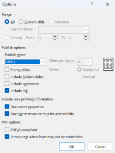
If saving as a PDF, follow these additional steps:
- Select “Save as type: PDF (*.pdf).”
- Click on “Options.”
- Ensure the “Document structure tags for accessibility” checkbox is selected.
- Click OK and Save.
Finally, when saving your document, take a moment to add metadata which includes essential details such as authorship, keywords, and subject headings. More information can be found within this chapter under the following heading: Metadata for Accessibility
Follow this link for video instructions on: Saving and Naming a file (external site – opens in new tab)
Quick-Fire Fact: Need an instant screen reader perspective as you edit your content?
In Microsoft PowerPoint, make use of the Speak feature to swiftly check your content from a screen reader perspective while editing your presentation. By audibly articulating the content, this tool allows you to assess the reading order, ensuring your new presentation is not only visually effective but also accessible to screen reader users.
More instructions on activating and using the feature can be found in our chapter on: Updating your existing PowerPoint Presentation for Accessibility
Setting up your Slides for Accessibility
Instead of starting each slide from scratch, explore the built-in layouts offered by PowerPoint.
Why does it matter? Well, the built-in layouts aren’t just convenient for aesthetics; they play a vital role in enhancing accessibility because assistive technologies often interpret the content on a slide based on the order in which items were added. Built-in layouts are designed with this in mind, ensuring a logical and accessible sequence.
Take, for example, the typical arrangement of a “Title” followed by other items, proceeding from left to right and top to bottom. This intentional structure makes it easier for screen readers to navigate through the content seamlessly. On the flip side, crafting slide layouts from scratch might inadvertently disrupt this flow, making it challenging to maintain a coherent order.
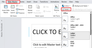
Slide Master is the best function to review the various slide layouts available. Each layout serves a specific purpose, and you can customize them to prioritize logical sequencing of your slide contents.
The Slide Master menu
Within the Slide Master view, you wield the ability to define fonts, colors, and placeholders consistently across all slides. To access the Slide Master view, navigate to the “View” tab and select “Slide Master.”
Our first step is making sure that the standard font used for normal text is optimised for accessibility, and most common fonts will be fine: Sans-Serif fonts such as Arial and Calibri are ideal because the contrast between upper and lower case, and numeric, characters, are clear. Avoid complicated, decorative or handwriting fonts, and those within which individual characters are particularly narrow.
How to do it:
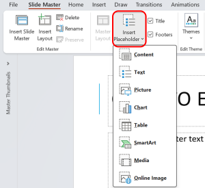
- Customizing Master Layout: Here, you can modify the placement of placeholders for titles, content, images, and more. Each layout caters to specific content types, ensuring a consistent and visually appealing design across your presentation.
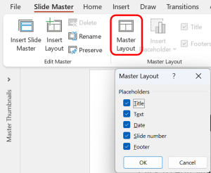
- Customizing Placeholders: This opens a menu where you can choose from text, content, picture, chart, table, and more. Then you could simply click and drag to reshape or resize, ensuring each element finds its perfect spot.
Using Titles for each slide
Unlike certain formatting nuances like bold, italic, or font size, which may not be perceptible to screen readers, slide titles offer a structured and accessible approach in comprehending the hierarchy of information. While visual formatting may be overlooked, the use of slide titles ensures that the content’s organizational structure is effectively conveyed. Screen readers, for instance, can announce the slide title as a heading, providing users with a sense of the presentation’s flow and enabling them to navigate between sections seamlessly.
Follow this link for video instructions on: Using Titles to make PowerPoint Slides Accessible (external site – opens in new tab)
Quick-Fire Fact: Typing an abbreviation/acronym?
Make sure you have a full stop (period) after each character. Otherwise, a screen reader will try to pronounce it as a single word. For example, M.H.A is more accessible than MHA.
Check the Reading Order
As you progress in crafting impactful slides using the Slide Master and incorporate various elements to enhance your presentation, it becomes essential to ensure that these objects are placed in the appropriate and intended reading order. This is particularly crucial when you’ve introduced additional elements, such as charts, tables, or text boxes, to visually convey information or elaborate on specific points. Managing the sequence in which these elements were added can become challenging.
This is where the Selection Pane in PowerPoint comes to your aid, providing a clear and intuitive solution for organizing and navigating through the diverse elements within your slides.
How to do it:
Accessing the Selection Pane:
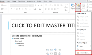
- From the “Home” tab go to the “Drawings” section and select the “Arrange” option, and choose “Selection Pane” from the dropdown menu.
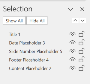
- The Selection Pane will unveil a list of all objects, shapes, and text boxes present on the slide.
Organizing Elements for Accessibility:
- Each item is accompanied by an option for visibility and to lock the position of the objects. It allows you to rearrange the stacking order of objects, ensuring elements are positioned logically. Objects listed at the top are read first, progressing downward in the order of the list.
Renaming and Identifying Elements:
- Double-click on an item in the Selection Pane to rename it. This feature is particularly beneficial when standard names like “Rectangle” or “Text Box” don’t convey meaningful information.
- Meaningful names enhance both the author’s and the audience’s understanding of the content structure.
Follow this link for video instructions on: Using Slide Master and Selection Pane for organizing the reading order in PowerPoint (external site – opens in new tab)
Quick-Fire fact: Using Bold, Italics and Underlining or CAPITALS for emphasis?
This won’t be picked up by screen readers. However, if the intention is to indicate a change in tone such as a shout, assistive technology can pick up an exclamation mark.
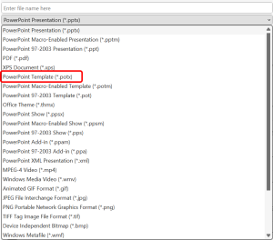
Creating your PowerPoint Template
Once you have a slide deck set up for accessibility for the first time, you can save it as a Template so that in the future, you can jump straight into the same, accessible settings.
- Click “File” and select “Save As.”
- Choose a location where you want to save the template.
- In the “Save as type” dropdown, select “PowerPoint Template (*.potx)”.
- Click “Save.”
Enhancing Readability with Colour Contrast
A presentation’s effectiveness should not hinge solely on visual elements, as this can create barriers to accessibility. One crucial aspect to consider is the contrast ratio between the text and the document background – a factor that significantly impacts readability and comprehension. So when you need to use colour formatting beyond black and white for the elements in your presentation, consider the following:
- Envision your presentation without colour—does it still convey the supposed meaning? If not, then you might refer to strategies to incorporate text-based formatting as discussed in the previous sections of this chapter.
- Utilize the Colour Contrast Analyser (external site – opens in new tab) to assess text and other elements in your presentation.
- Based on the contrast result using the analyzer, adjust your font contrast and aim for a minimum contrast ratio of 4.5 : 1 to enhance readability and comprehension.
- Choose contrasting colors wisely, keeping in mind the diverse visual needs of your audience.
Follow this link for video instructions on:
1. Ensuring adequate colour contrast (external site – open in new tab)
Considerations for using Slide Transitions and Animation
Slide Transitions: Guiding Principles
- Minimalism is Key: Aligning with Web Content Accessibility Guidelines (WCAG), it is recommended to keep transitions to a minimum. This prevents flashing or strobe effects, crucial in avoiding triggers for photosensitive epilepsy and minimizing distractions for all users.
- Purposeful Integration: If they need to be used, they should serve a purpose, contributing positively to the presentation. Overly flashy or fast-paced transitions can impede focus, causing confusion or disorientation.
- Moderation is Crucial: Overuse of transitions can be counterproductive, overshadowing content. Restrict transitions to pivotal moments or shifts between major sections.
Slide Animations: Striking the Right Balance
- Moderation Matters: Avoid overwhelming the presentation with excessive animations. Each animation should have a distinct purpose, contributing meaningfully to the content.
- Simplicity is Key: If they must be added, opt for simple and consistent animations, steering clear of complexity that might be challenging for users to follow. Choose straightforward animations like fade.
- Timing is Everything: Provide sufficient time for animations, allowing users to absorb content before transitioning to the next slide. Avoid rapid animations or transitions that may be too swift.
- User Control: Grant users the option to disable animations if they find them distracting. This empowers users to tailor their experience based on individual preferences.
- Steer Clear of Strobing Animations: Flashing or strobing animations can trigger seizures and should be avoided.
Follow this link for video instructions on: Appropriately using Transitions and Animations for accessibility (external site – opens in new tab)
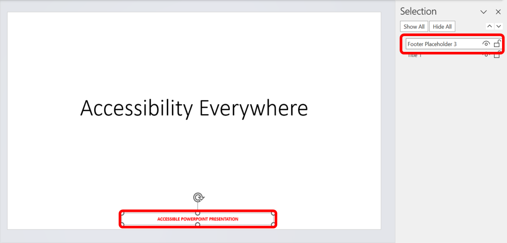
Quick-Fire Fact: Using headers, footers or a watermark?
These are unlikely to be read by Assistive Technologies. If you do need to use them, ensure the information is captured in a separate “Textbox” on the Slide Master within the slide.
Follow this link for video instructions on: Making background information accessible in PowerPoint (external site – opens in new tab)
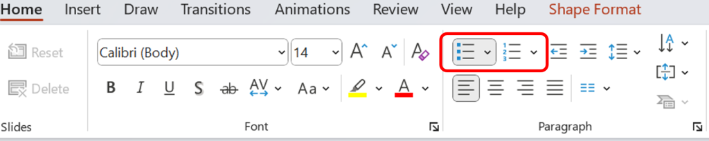
Creating a List
Even if only listing a couple of items, always use the built-in PowerPoint function to format the list, rather than using the tab function. This will allow assistive technologies to recognize your text as a list. These options are housed under the Home menu:
Follow this link for video instructions on: Creating Accessible Lists in PowerPoint (external site – opens in new tab)
Using Tables within PowerPoint
We’re not going to run through a general ‘how to’ of the Table functions here: a quick online search will bring up instructions of how to use them. Our focus is on the accessibility functions within PowerPoint tables. There are a number of things you can do to ensure your Tables are accessible.
- Only use a Table when you need to, not as a way to create organize text on the slide (see Using Columns, below)
- Make sure the object on the page actually is a Table…this may sound obvious, but if you are copying and pasting a Table from another source, make sure you paste the Table, and not a picture of a table. If unsure on this, you can find instructions online.
- Add Alt-Text to each table, naming and describing the content.
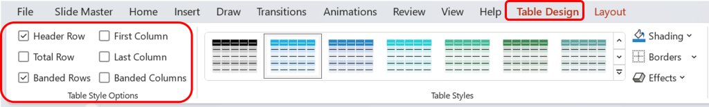
- Check that your Header Row and Column settings are optimised for accessibility. These settings ensure that a screen reader knows that it should treat information in the first row or column of a Table differently from the information within the Table itself: you have to tell the assistive technology that these are titles, rather than data points.
For more information, and for guidance on how to create more complicated tables, see this guidance from the Web Accessibility Initiative: link to W.A.I guidance (opens in new tab)
Follow this link for video instructions on: Creating accessible tables in PowerPoint (external site – opens in new tab)
Include Content in all the Cells
Empty cells in a table can be confusing for both visual and screen reader users, leaving them to question if there’s missing information. To avoid these uncertainties, populate all cells, even if it means inserting a simple “not applicable” or “none” to signify an absence of data.
Avoid or Simplify Complex Tables
Opt for simplicity when structuring tables, as navigating through information shouldn’t feel like deciphering a puzzle.
- Keep it straightforward with a maximum of one header row and one header column.
- This clarity extends to abbreviations or acronyms—spell them out for universal understanding.
- Complex tables, marked by multiple headers, merged cells, or embedded tables, pose challenges. Instead, break them down into two or more simple tables, enhancing accessibility without compromising on content.
- Resist the temptation to merge cells or create nesting tables; simplicity not only aids accessibility but also fosters a user-friendly experience.
Provide Contextual Information
Tables aren’t supposed to be standalone entities; they often come with a backstory, providing context to the data they present.
Add Alt-text
When providing alt text for tables, it’s crucial to extend beyond mere identification and offer a narrative that encapsulates the table’s context and significance. For instance:
- Instead of: “A table displaying quarterly sales”
- Use: “A table delineating quarterly sales figures for the past year. Noteworthy is the substantial increase in Q3, indicative of a successful marketing campaign during that period.”
For more information on how to best capture alt text for tables and other objects, please see our dedicated chapter on: Creating Accessible Images and Other Visual objects
In crafting accessible tables, Excel has an important role as a powerful tool for creating tables, even when the tables are required for your PowerPoint presentation. Its data processing and visualization features simplify the table design process, allowing for easy manipulation of data without compromising structure. Once the table is perfected in Excel, it could be imported into PowerPoint, while still preserving the table’s organization and accessibility.
Using Images, Charts and Graphs
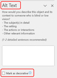
For anything on the slide which is not text, we need to provide a description for those who cannot access the visual information, and also ensure that the item in question is picked up by assistive technology at the correct moment in its ‘reading’ of the slide.
To add Alt. Text, we can right click on the item and then select the Alt-text option. If the object is purely decorative, and adds nothing to the meaning of the document, select the Mark as Decorative Object. In all other cases, use the text box to describe the content of the object.
Follow this link for video instructions on: Editing Images, Charts and other objects for accessibility in PowerPoint (external site – opens in new tab)
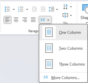
Creating columns
We can create columns of text within PowerPoint in a few different ways, such as using text boxes, but for an accessible option, we need to use the PowerPoint function for columns. However, we should first consider whether it is absolutely necessary to do so because even the proper function is not ideal for some assistive technologies. Where there is a clear and demonstrable benefit to using columns, you will need to use the Layout options to create them. You can do so before adding the content, or you can highlight material in the document and then instruct PowerPoint to move it into columns.
Follow this link for video instructions on: Organizing content in columns in PowerPoint (external site – opens in new tab)
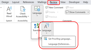
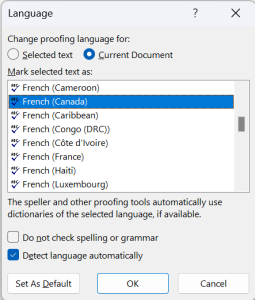
Quick-Fire Facts: Using more than one language (even for a few words)?
You need to tell assistive technologies so that they know to read the text as a foreign language. Right click on the word(s) and then under the Review options, select Language and then “Set proofing language”.
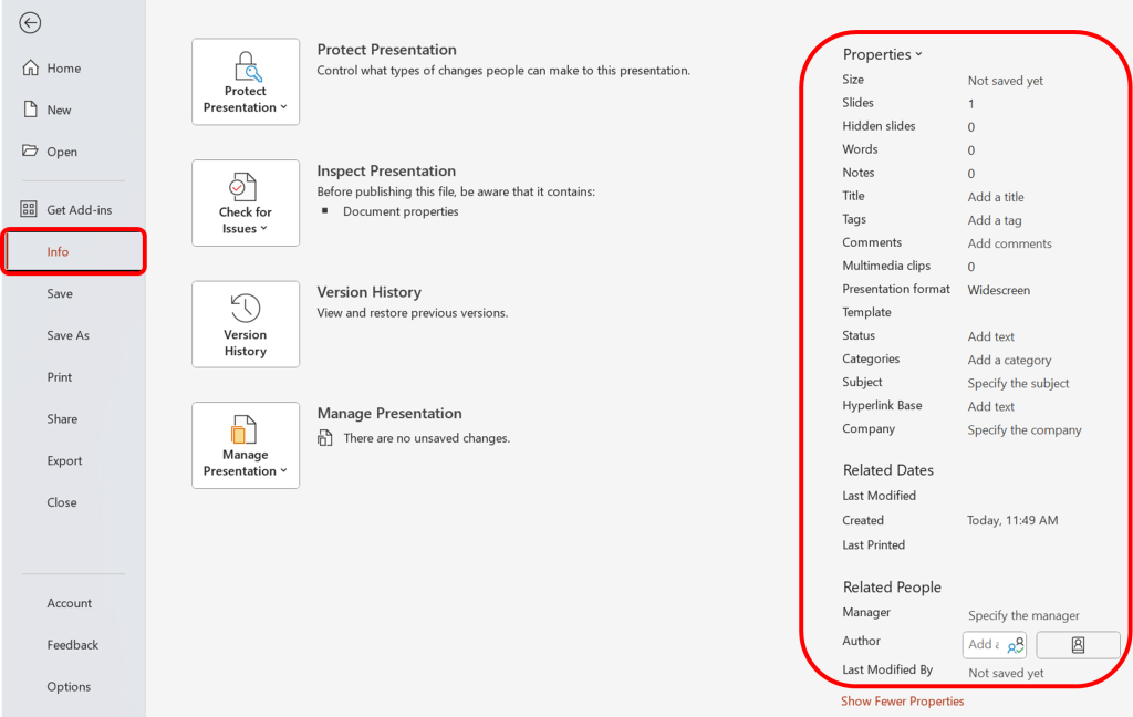
Metadata for Accessibility
To put it simply, metadata, includes details like authorship, keywords, and subject headings, giving the presentation a unique identity and making it easier to locate – the author’s name signifies ownership, while keywords and subject headings act as navigational aids.
How to do it:
- By clicking on the “File”, navigate to “Info” in the left menu
- Find the “Properties” option at the top right corner.
- Input a descriptive title in the “Title” field. Enter the author’s name in the “Author” field. Input keywords, a brief description, and subject headings in the respective fields, and save the changes.
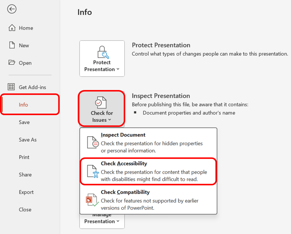
Using the Accessibility Checker
Word provides a robust tool, the “Accessibility Checker,” to assess the accessibility of your presentation. This feature conducts a thorough review, identifying potential issues that users with disabilities may encounter.
However, it is important to note that the Accessibility Checker cannot always detect all the accessibility issues comprehensively. For instance, while it can identify missing alternative text, it cannot not ascertain if the alternative text is accurate and descriptive. Additionally, it doesn’t test for certain issues, such as color contrast.
How to do it:
- Ensure your file is saved in the “pptx” format. Older formats may not be compatible with the checker.
- Navigate to the “File” menu. Under the “Info” section in the left window pane, select “Check for Issues” and then choose “Check Accessibility.”
- A task pane will open, presenting the inspection results.
- Select a specific issue to view additional information and follow the provided steps to rectify or revise the content.
Some of the common accessibility errors and warnings, and information on how to update/adapt your existing Word resources for accessibility can be found here: Chapter: Updating your Existing PowerPoint Presentation for Accessibility
Please don’t hesitate to contact us with suggestions and updates using this: email link for updates(opens in external site/application)
Reference: ED Accessibility Requirements for Electronic Documents | U.S. Department of Education.

Feedback/Errata