10. Word Document for Accessibility
Ben Tait and Pratik Bhawar
Reviewing your Existing Documents for Accessibility
Accessibility Checklist
Utilize this Accessibility Checklist to ensure you’ve covered the essentials of accessibility for any new or existing document. Each item on the checklist is linked to the corresponding chapter/section, providing practical tips for further understanding and editing your documents.
- My document has a title which is meaningful to the students/users?
- If not, please follow this link for more information on: Saving and Naming the file
- My document uses Heading Styles to structure various sections of information?
- If not, please follow this link for more information on: Setting up your document for accessibility
- My document uses standard and easily readable fonts?
- If not, please follow this link for more information on: Formatting text for accessibility
- My document has sufficient colour contrast between the text and the background?
- If not, please follow this link for more information on: Enhancing Readability with Colour Contrast
- My document uses tables which are simple and have definite header rows?
- If not, please follow this link for more information on: Using Tables within Word
- My document uses Word’s built-in functions for creating lists and columns?
- If not, please follow this link for more information on: Creating a List and Creating Columns
- My document uses hyperlinks with concise and meaningful names?
- If not, please follow this link for more information on: Using Accessible Hyperlinks
- My document has alternative text for images and other visual objects?
- If not, please follow this link for more information on: Create Accessible Images and Objects
- My document has supplementary descriptions for embedded audio/video files?
- If not, please follow this link for more information on: Create Transcripts, Captions and Audio Descriptions
- My document passes the accessibility checker?
- If not, please refer to the information in this chapter below.
Running the Accessibility Checker
When you already have a bank of resources created and want to begin by ensuring that those resources are optimized for accessibility, the first source of guidance is the Accessibility Checker. It serves as a quick preliminary check, swiftly scanning your content to pinpoint potential accessibility issues. This initial step offers an easy and insightful analysis, guiding you toward making informed edits and improving the overall electronic accessibility of your resources.
How to do it:
- Ensure your file is saved in the DOCX format. Older DOC files may not be compatible with the checker.
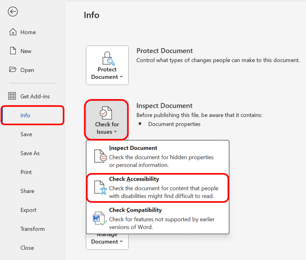
- Navigate to the “File” menu. Under the “Info” section in the left window pane, select “Check for Issues” and then choose “Check Accessibility.”
- A task pane will open, presenting the inspection results.
- Select a specific issue to view additional information and follow the provided steps to rectify or revise the content.
The Accessibility Checker categorizes necessary changes into: Errors and Warnings. Errors denote content that renders a file challenging or impossible for individuals with disabilities to comprehend, requiring immediate attention for rectification. On the other hand, Warnings flag elements that, while not universally obstructive, can still impede the understanding of individuals with disabilities in specific cases.
Quick-Fire Fact: Need an instant screen reader perspective as you edit your content?
In Microsoft Word, use the Alt + Ctrl + Space function to activate the built-in screen reader mode. This allows you to swiftly check and edit your content from a screen reader’s perspective, ensuring optimal accessibility as you work on your document.
Accessibility Errors in Word
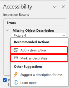
Missing Object Description
When an object lacks a descriptive alternative, it becomes a hurdle for users relying on assistive technologies. Upon encountering an object without alternative text, the checker provides a clear directive to either “Add a description” or “Mark as Decorative“.
Consider the following questions for the next steps:
1.Does your graphic serve more of a decorative purpose? In other words, is it primarily a design element that does not convey content? If so, you should:
- avoid unnecessary text descriptions by clicking on “Mark as Decorative” option.
2.Does your graphic serve a functional purpose? In other words, is it conveying non-text content? If so, you should:
- provide a text alternative that serves the equivalent purpose of the non-text material by clicking on the “Add a description” option.
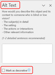
For detailed guidance on how to capture the meaning in Alt Text, see our dedicated section here: Create Accessible Images and Other Visual objects
Follow this link for video instructions on: Making Images, Charts and other objects accessible in Word (external site – opens in new tab)
Once you’ve taken these steps, ensure the effectiveness of your alt text through verification. Utilize the built-in screen reader in Word by pressing “Alt+Ctrl+Space.” This inspection allows you to confirm that the alternative text is not only accurate but also conveys a meaningful description of the image or object.
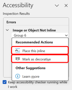
Image or Object not Inline
When the Accessibility Checker flags an image or object as not being inline, it’s alerting you to a potential readability challenge for users of assistive technologies. An inline object is positioned within the flow of the text, providing a logical reading order for the content in the document. To address this Error:
- If the image or object doesn’t convey meaningful content and is purely decorative, consider marking it so, as mentioned in the previous section.
- Otherwise, inline the Object by clicking on “Place this inline” option to ensure that images or objects are inserted in a way that maintains the natural flow of the content.
- Note that this may mean that the page layout is not quite so neat in appearance, but it is an essential piece of formatting for accessibility.
After making adjustments, it’s essential to test the document’s readability. Utilize the built-in screen reader in Word by pressing “Alt+Ctrl+Space.” This allows you to audibly review the document and confirm that the images or objects are now inline, ensuring that users relying on assistive technologies can navigate through the content effortlessly.
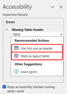
Missing Table Header
For tables intended to convey data, it’s essential to designate header rows explicitly. When the Accessibility Checker identifies a table without a specified header row, it signals a potential challenge for users relying on screen readers. To address this error:
- If a table doesn’t convey meaningful information or contribute to the overall comprehension of the content, it is considered decorative. In such cases, opt for the “Mark as layout table” option. By using this option, you communicate to screen readers and other assistive technologies that there’s no essential data encapsulated in the table, eliminating potential confusion for individuals relying on these tools.
- However, if the table contains meaningful data, select the “Use first row as header” to automatically designate the first row of your table as its Header.
- If not already done, select the first row of your table, right-click, and choose “Table Properties.” In the “Row” tab, check the option that says “Repeat as header row at the top of each page.” This ensures that screen readers identify and announce the header row at the beginning of each page.
For detailed guidance on how to create an accessible table from scratch, see our dedicated section here: Create Accessible Tables
Follow this link for video instructions on: Creating Accessible Tables in Word (external site – open in new tab)
Accessibility Warnings in Word
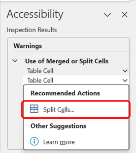
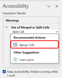
Use of Merged or Spilt Cells
The “Merged or Split Cells” warning in Word serves as a gentle reminder to evaluate the structure of your tables for optimal accessibility. While merged or split cells might not always pose a significant barrier, they can impact the coherent interpretation of the data in your tables by screen readers.
If cells have been merged within a table, consider whether this merging is essential for the visual presentation. If not, unmerge the cells by selecting “Split cells” option and vice-versa if there are split cells in your table.
For more information, and for guidance on how to create complicated tables, see this guidance from the Web Accessibility Initiative: link to W.A.I guidance (opens in new tab)
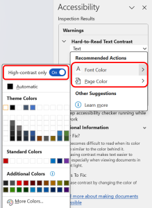
Hard-to-Read Text Contrast
The “Hard to Read Text Contrast” warning in highlights instances where text might pose readability challenges due to insufficient contrast with the background. Addressing this warning is crucial for ensuring that all readers, including those with visual impairments, can comfortably engage with your document. To address this warning:
Change Font Color: If the warning pertains to specific text elements, such as font or characters, a simple solution is to modify the font color. Opt for high-contrast combinations to ensure readability for all readers. Upon selecting this action item, make sure to toggle the “High Contrast Only” option to view and apply the most appropriate Colour option.
Adjust Page Color: In cases where the overall page background contributes to the low contrast, changing the page color is a viable option.
Hard-to-Read text in Table:
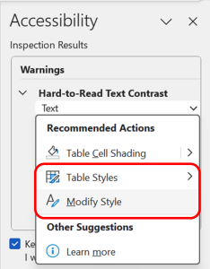
If the warning specifically relates to table content, consider adjusting the shading settings. Select the option for “Table Cell Shading”. Upon selecting this action item, make sure to toggle the “High Contrast Only” option to view and apply the most appropriate Colour for the table.
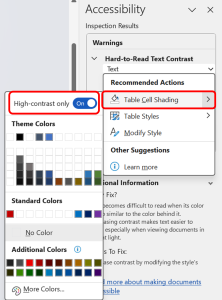
For a more comprehensive approach, you can modify the overall table style to ensure consistent readability. By clicking on the “Table styles” option you can select from a catalogue of varied-coloured table styles that fit most appropriately with the contrast requirements for your document. Or else, you could click the “modify style” option to tweak the current colour scheme of your table if it only requires minor changes to satisfy the contrast requirement.
For detailed guidance on how to create appropriate colour contrast for your document, see our dedicated section here: Enhancing Readability with Colour Contrast
Follow this link for video instructions on:
1. Ensuring adequate colour contrast (external site – open in new tab)
Please don’t hesitate to contact us with suggestions and updates using this: email link for updates(opens in external site/application)
Reference:

Feedback/Errata